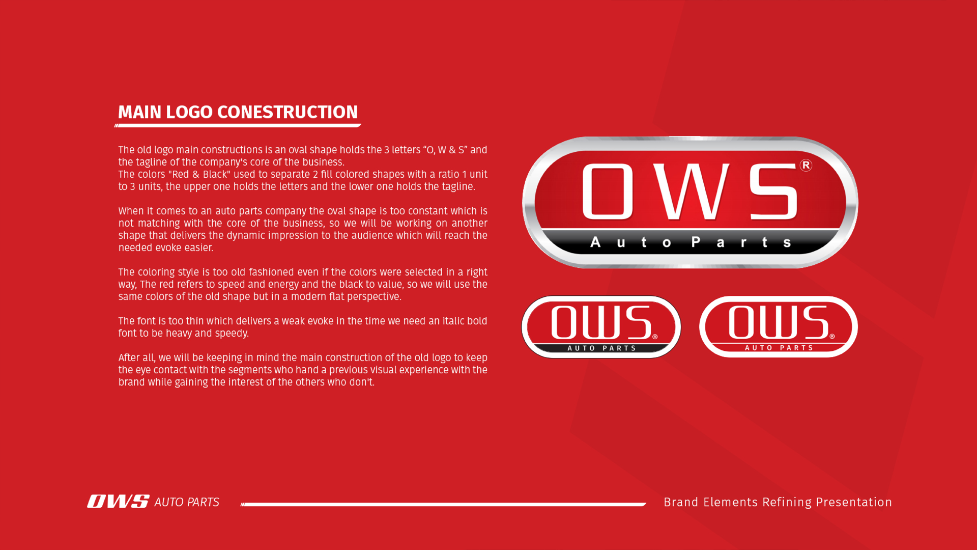
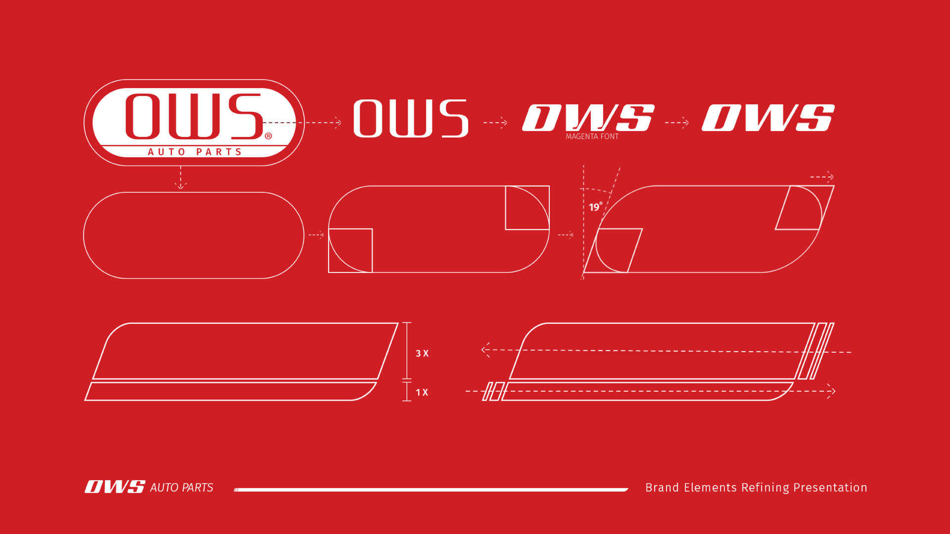
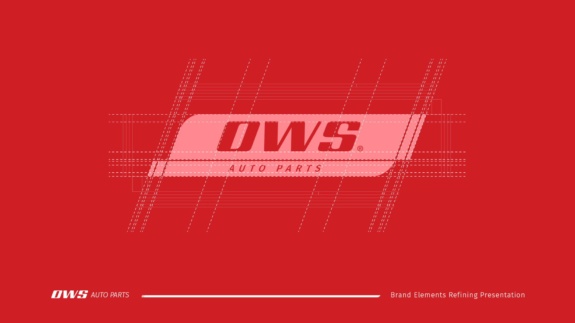
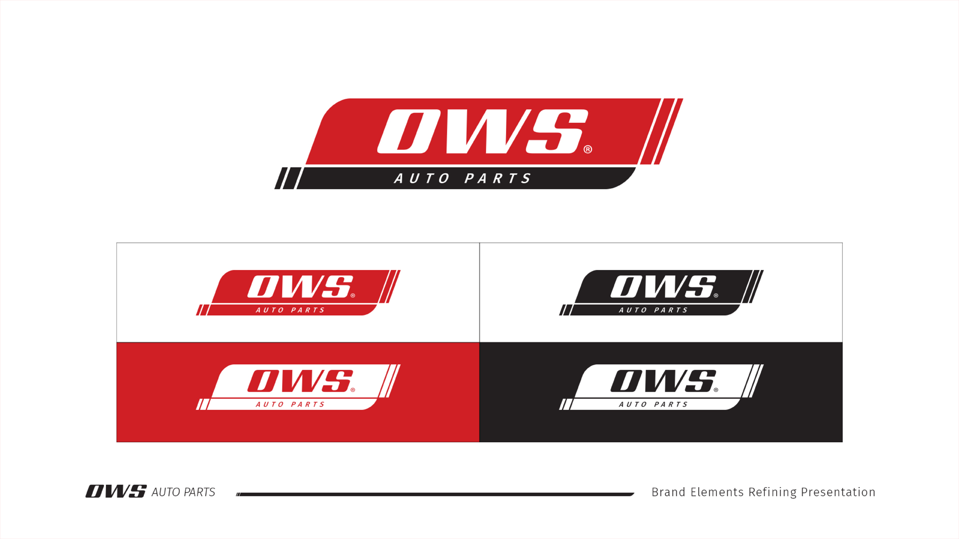
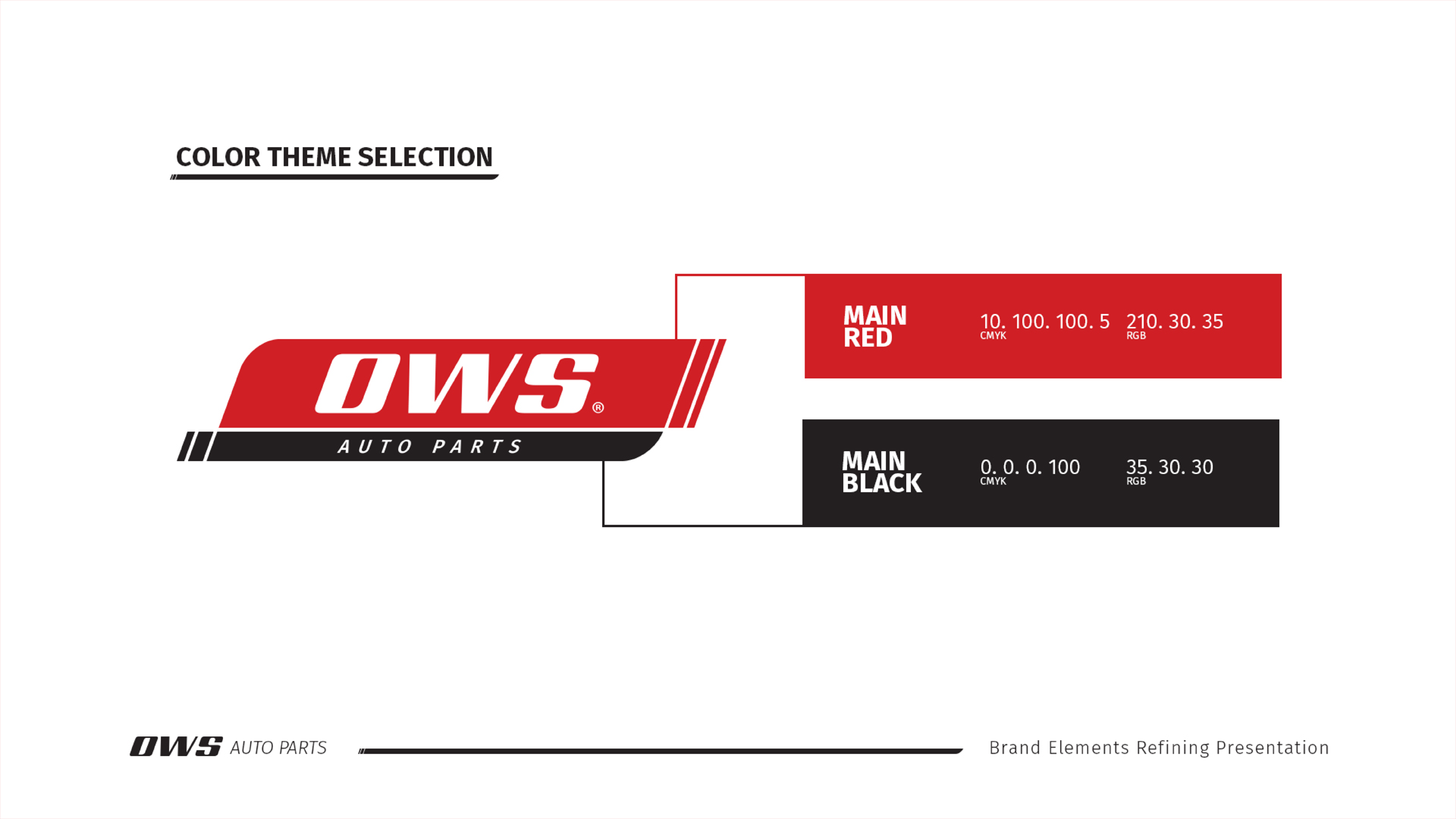
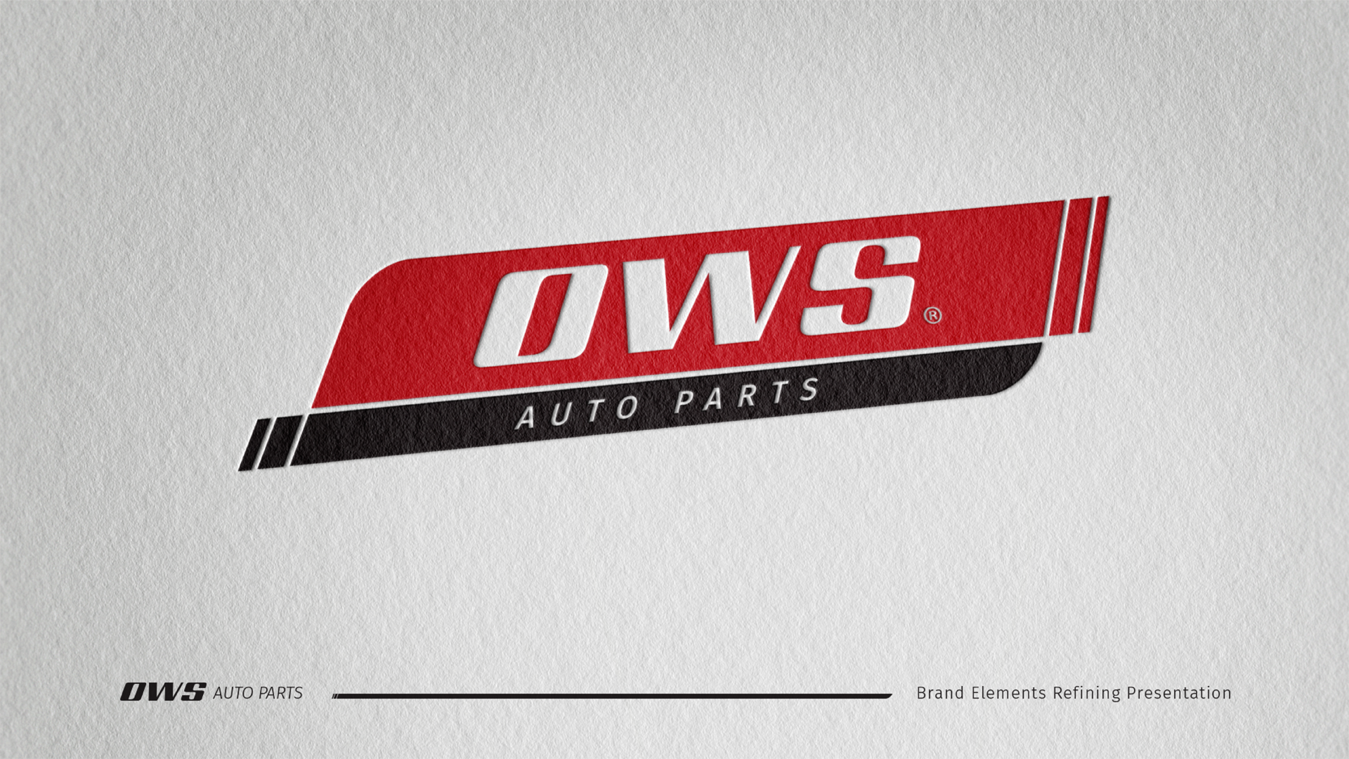
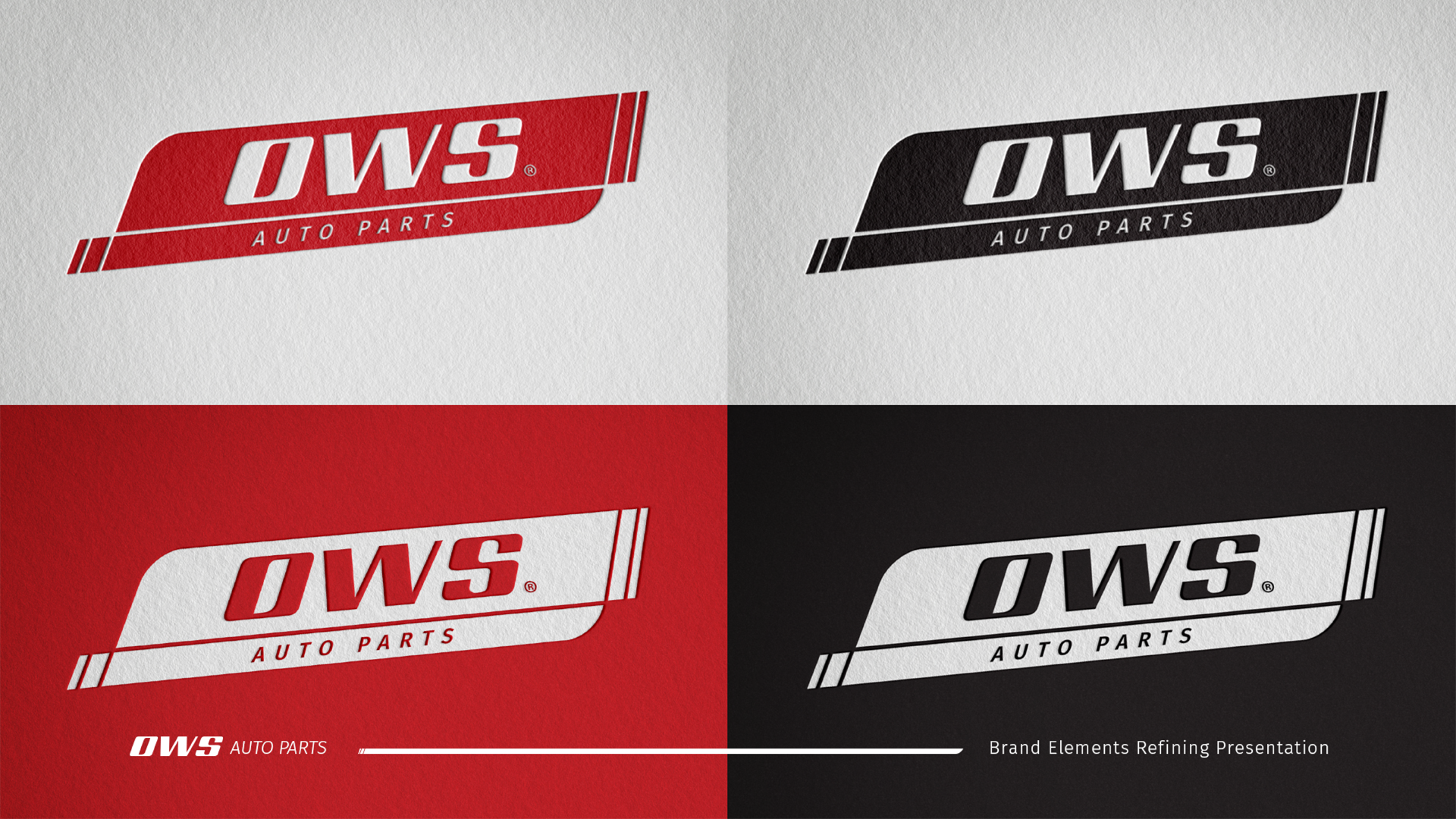


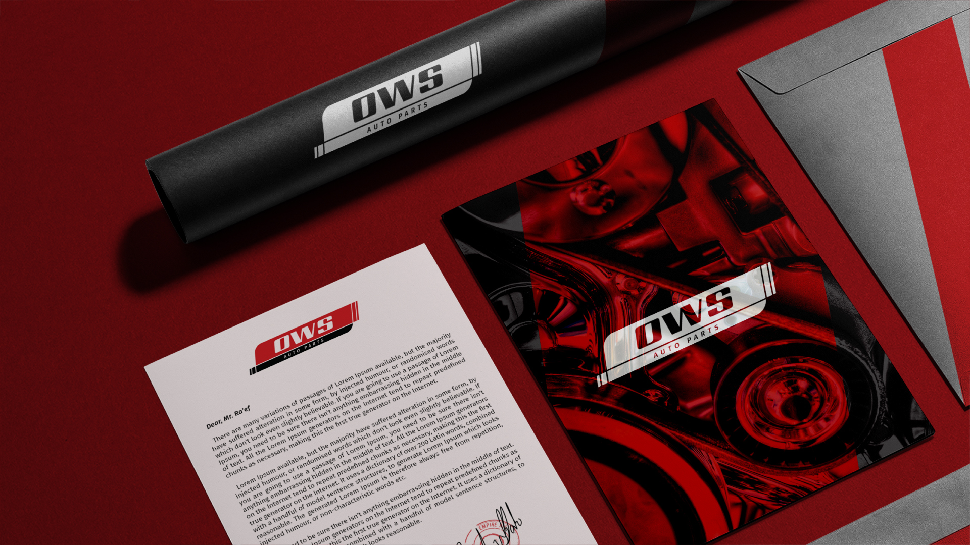

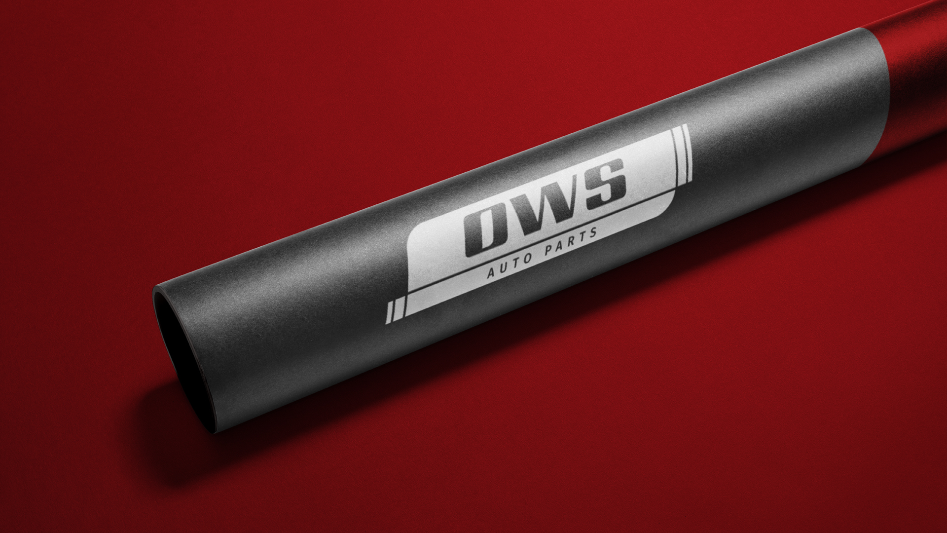


The old logo, an oval shape with the initials "O.W.S" and a tagline, uses red and black in a 1:3 ratio. While the colors work—red for speed and energy, black for value—the oval shape feels too static for an auto parts company. We'll redesign it with a dynamic shape, retain the same colors with a modern twist, and replace the thin font with a bold italic one to convey strength and speed. The new logo will maintain elements of the original for brand recognition while appealing to new customers.